Friday, September 6, 2013

The colour explosion


Today's interior space has many different colour scheme combinations and lots of bright colouring, I've decided to focus on two key design elements within this fabulous space.


Firstly, the use of harmony through texture that's created within the space using the colour red on the wood like surface of the coffee table and the little upholstered foot stool directly in front help blend the colour harmoniously through the space.

 & Secondly, the  radial balance which is subtly established around the coffee table which is an anchor point for the space really helps mesh the different colour combinations and patterns used throughout


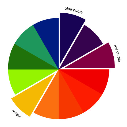
Today's interior space speaks red, red-violet, green and yellow- green creating a double complementary colour scheme.


"A double complementary colour scheme is made up of two hues beside each other and their complementary colours on the colour wheel"


Below is a colour wheel indicating the double complementary colours ill be using to re create this look.


Now Get the Look


Firstly we need to know what colours we'll use from the red, red-violet, green and yellow green wedges of the colour wheel. Below are swatches of the shades we'll need for the look.


That red Coffee Table


Low Buffet - The Importer


This low buffet table will work perfectly as a coffee table, it is still chunky like the original coffee table and has that punchy red colour with the same messy antique finish - the perfect anchor point for the space.


The Foot Stool


I chose this ottoman from Interior Design online and will reupholster it with the fabric from Warwick to help enhance the harmony of texture like in the original image.


My Tip: Don't stress if you cant find a matching floral fabric, as long as you incorporate that key red colour don't hold back - choose an adventurous fabric that you like.


The Armchair


This chair from Le Forge fits the style of the armchair in the original picture almost perfectly but the shade of green-yellow just wasn't quite right so i'll reupholster it with this James Dunlop Fabric to give that depth of colour.


The Cushion fabric

Amigo Sienna 


The colouring in the original red-violet cushion was very punchy, which is nice - However, i think something with a little more depth will really tie into the space better so i chose another James Dunlop fabric to achieve the look.

My Tip: Cushions aren't the most important aspect in this space so feel free to use a shade of red-violet like this in a stripe form or floral to fit your personality - keep it fun & fresh.


Those Fabulous Green Doors


Finding doors in any colour of green that was suitable for the space was hard so i found these antique doors from The Importer & have decided to paint them with a Resene paint to achieve the original look.


Here's the finished look


Remember it's all about having fun


Tuesday, September 3, 2013

Lot's of Pattern up in here


This interior space has an array
 of colour and pattern combinations, in today's post ill be focusing on two key design elements within the space.


Firstly, the use of rhythm through pattern is present throughout the space is repeated from the flower shaped wall decals to the bed spread creating a cohesive space that flows.

 & Secondly, the use of a strong diagonal line where the wall and ceiling meet which helps create height and depth to the space whilst also helping guide your eye through the colour. 


Today's interior space speaks yellow-green, red-violet, blue and orange creating a Tetradic colour scheme.


"The Tetradic colour scheme is made up of four different hues evenly dispersed around the colour wheel"


Below is a colour wheel indicating the tetradic colours ill be using to re create this look.


Now Get the Look


Firstly we need to know what colours we'll use from the orange, yellow-green, blue and red-violet wedges of the colour wheel. Below are swatches of the shades we'll need for the look.


My Tip: In the original image you can see different variations in colour used throughout the space, don't be afraid to change the base palette i've got above, just use these as a reference point and you'll be on the right track


The Wallpaper


In the original image the wall is a mess, there is so much colour and pattern going on that i've chosen this wallpaper from the paperroom as the base colour 
- this may look intense but i'll be adding frames and artwork to both tone the look down and replicate the original image. 


Wall Accessories time


I've gathered together a few different wall accessories that you can use to help get the same colour impact as in the original image, Orange Frame ,clock,flower painting are all simple ways to achieve the look


Now that bedspread


Red-purple Paisley - The quilting shed


Finding a similar bed spread was a challenge so i chose this paisley print fabric which has flowers in it to use on the bed, i do agree it isn't a perfect colour match but is a great example of the tip i gave when choosing your palette - dont be afraid to go a little darker or lighter with your colour choices, the original picture does have this purple shade in the bed spread so that's where i took the inspiration from.


Here's a side by side comparison


This image can be really dynamic and can be taken in many different directions, make it personalised and be original.


Remember to always have fun


Tuesday, August 27, 2013

It's an Analagous World


This interior space has a striking colour combination featuring four main design elements which i'll be focusing on in this post.

Firstly, the use of visual texture present through the green plant-like ornament on top of the books and the luscious linen sofa which really shout "feel me" or "sit down and relax on me".

Secondly, progression through space has been used through the plant vegetation and greenery which is brought from the outside then repeated inside, this helps visually link both spaces together seamlessly.  

Thirdly the horizontal lines  easily found through the lines on the windows, sofa squabs and coffee table helps give the illusion of extra width to the space.  

& lastly the rhythm of colour used through the soft furnishings is designed to help feature the three chosen analagous colours and also create different anchor points in the space.

Today's interior space screams of a green, yellow-green and yellow  analagous colour scheme.


"The analagous scheme is made up of hues next to each other on the colour wheel"


Below is a colour wheel indicating the analagous colours ill be using to re create this look.


Analagous colour scheme


Now Get the Look


Firstly we need to know what colours we'll use from the green, yellow-green and yellow wedges of the colour wheel. Below are swatches of the shades we'll need for the look.


My Tip: Try your best sticking to these colours for all main pieces within the space, otherwise you may wind up with an unbalanced overall look.


The Linen Sofa


Minotti. Anderson Slim from ECC


This sofa is a great recreation of the original piece in the above picture, the colouring  and style is very similar - this will be picture perfect with the addition of great cushions.


My Fave- cushion fabrics 


These fabrics are all sourced from James Dunlop - I have shown two different cushion combinations to show variation in using pattern and solid groupings together. Both options would work really nicely together in this and really help emphasis the space.


It's time for that Lamp


I found it a little challenging to find a table lamp that was a suitable colour so i decided to have some fun by using a plain lamp from freedom furniture and  covering it in wallpaper from the paperroom. It still incorporates the colour we need from the original image whilst being a little bit different and quirky.


& lastly filling the space with your own little treasures to finish the look - this parts all about having fun.
Go wild and express your own style it's all about making our house your home.


 Here's the finished look


Remember to always have fun


Tuesday, August 20, 2013

Purposefully Purple


This interior space had many design elements present but I'm going to focus on a few key ones.

Firstly, the use of curved lines used in the arch of the bunk bed helps create volume to what would be a fairly confined space, also creating a strong anchor point within the space.

Secondly, tactile texture through the bed coverings, cushions and rug is a very strong feature in the space enticing us to want to touch the different textures present.

& thirdly the rhythm of design used to create a princess/ palace type theme in what looks like a girls bedroom through the repetition of colour from the walls to the soft furnishings.


Today's interior space screams of a red-purple monochromatic colour scheme.


"The monochromatic scheme is made up of mostly one hue with changing tints & shades"


Below is a colour wheel indicating the red-purple hue ill be using to re create this look.


Now Get the Look


Firstly we need to know what colours we use in the red-purple wedge of the colour wheel, below are swatches of the shades we'll need for the look.


My Tip: It's really important that most of the colours you use has a red tinge, this will help you stay on the right path for the overall look and make styling at the end nice and simple.


It's wallpaper time


Disney Room Mates DK5990


This wallpaper is slightly different to the original picture in terms of colour however it still carries the same striped theme. The wallpaper isn't a major focal point of the space so going for more subtle colours like this will be a nice contrast to the soft furnishings which have a red base to them. 


Let's talk curtains

                  Ashby (Lorient)


This James Dunlop fabric will be prefect for the space, replicating the original pictures design  that has a  floral curtain fabric with similar colourings to this.

Remember, you can always refer back to your colour swatches if you're having trouble.


My favourite part - Fabrics


These Three fabrics are from James Dunlop - 1&3 are accessory fabrics perfect for the cushions on the armchair and bed. 
Swatch 2 is an upholstery fabric which is perfect for both the bed coverings and armchair if wanted.


& Those last touches - A Rug and chair


This rug is also different from the original rug in the image but I think its better than the original. It's still dark a rich but is cool combining specks of the lighter colours used in the soft furnishings. Feel free to do this also if you feel it's right.


I found this red chair  from Moidesign that matched the framing pretty well in the original picture, if you get it reupholstered with the James Dunlop Fabric above it would work really well in the space.


The Bunk Bed the best way to achieving a completed look is to replicate the bunk bed and  get it custom made, Urbankids is a company that  tailor to your needs and requirements, offering different bed sizes etc which is great so check them out.


Here's the finished look


Remember to always have fun.


Sunday, August 11, 2013

Red, Yellow & Blue


When Triadic colours combine a sense of balance is created


This interior space consists of the most obvious palette associated with a Triadic colour scheme  - The Primary colours of yellow, red and blue.


The space provides a variety of different visual elements which help convey a true triadic colour scheme.
The red palette has been achieved through the ceiling colour and lamp shade, the blue portion through the wall colour, sofa and ottoman and yellow aspect being the armchair and second ottoman which create strong anchor points for the space.
Soft furnishings have been used as soft touches to complete the look.


Another design element used is the heavy presence of asymmetry which has created a really cohesive triadic look.


" A Triadic Colour Scheme uses three colours evenly spaced around the colour wheel"


Now Get The Look

After consulting with our colour wheel we have determined that red, yellow and blue will be the colours we focus on when recreating the look.

My Tip: Make sure you try sticking to these three colours shades so you never go wrong, but don't be afraid to lighter or darker!


It's PAINT time


Needing ceiling and wall paint I chose both Resene paints.
Resene Astronaut Blue for the walls & Resene Daredevil for the ceiling.

My Tip: Go a little darker with your paint selections so you can go brighter with your furnishing options to create the perfect balance.


Resene Astronaut Blue
Resene Blue Astronaut


Let's talk about the SOFA

This sofa from the design depot is perfect for the space, colouring is more punchier which is really chic.

My Tip: Don't be afraid to go for a striking bold coloured sofa, its going to contrast so well with the punchy red and more mellow yellow.


Ruba 3 Seater Sofa


 That YELLOW ARMCHAIR
This armchair from Freedom furniture will be fab in the space, to channel the texture that was created in the fabric from the original picture add some patterned cushions
Below are a couple of chic options from Felt  & Luxury linens to complete the look


Danish Wing Chair Scooter Highlighter
Danish Wing Chair


& we can't forget that RED LAMP
This trendy ECC lamp will be the last anchor point for the space


Miss K by Flos


So I've ticked all the boxes for the main anchor points in the space, now its your turn. Have a go with the Ottomans in the middle of the space and let your creative juices flow. 


Tuesday, August 6, 2013

When styles combine

One of my favourite styles when thinking about design is using different combinations to create unique cohesive spaces.


In this space a combination of vertical and diagonal lines have been used to create volume and height to the space. The diagonal lines which can be seen in the floral wallpaper help add dimension to the space and creates a bold statement. Whilst the vertical lined wallpaper on the other wall helps break the compactness of the floral pattern and adds the height to the space.
Diagonal lines are also shown through the placement of the cushions on the sofa and in contrast the verticality of the sofa legs helps elongate the space.


Let's talk colour
This space uses a few different colour combinations but i'm going to focus on the obvious split complementary scheme which has been repeated throughout each section of the room.


"A split complementary scheme is when you take one colour on the colour wheel and use the two colours adjacent to its complementary colour"


Below shows a clear diagram which will help you better understand the concept and colours i'll be using.


Spilt Complementary Scheme


Now get the look


The Colours that we will be focusing on are yellow, blue-purple and red-purple.

When searching for wall paper and soft furnishing options ill continue to refer back to these swatches, making sure i'm sticking to the right colour scheme.

Blue-Purple-Yellow-Palette

It's Wallpaper time!


<br /><br /><a href="/content/grandads-stamps" id="node_link_text" class="active">View Image Details</a>
Grandad's Stamps - The Paper Room


 I found it challenging trying to find a floral wallpaper similar to the photo above so I decided to go completely different with this unique stamp print wallpaper called Grandad's stamps from the Paper room. This wallpaper still offers vibrancy and still combines the yellow, blue-purple and red-purple spilt complementary theme being achieved in the original picture.


My Tip: There is a lot of green going on in the wallpaper chosen, although  it won't be really noticeable on a larger scale you can always cover that with artwork or frames if you start to find to much green popping through. Also don't worry that there are more colours in this wallpaper it will work once on the wall.


TreliseStripe
Trelise Stripe


Next is the striped wallpaper, I chose this one by Trelise because it matches roughly the one in the picture above.


Just a little Note: As you can tell above my wallpaper options aren't identical to the original picture, that's okay, your wallpaper options can vary - that's the cool thing about quirky combination design.


Hilton 3 Seat Sofa Esquire Pewter
Hilton 3 Seater Sofa


I found a similar grey sofa from Freedom Furniture which I thought would work perfect for the space.


My Tip: A great easy way to add the split complementary scheme into the space is by replacing or recovering these sofa cushions with the three colour options. I recommend visiting your local fabric store or furniture.


Slab round table - ECC


Lastly a cute little white side table to finish off a majority of the furniture needed for the space. This one is from a favourite store of my ECC. Its called the Slab round table by Tom Dixon - LOVE IT!


As I always say you can't really go wrong with soft furnishings, I've got the ball rolling the more challenging aspects of the space so now its up to you to shop till you drop for all the extra bits and bobs to finish the space off. Good Luck !